
writing a report
Reports generally set out and analyse a set of facts or a situation It can, and mostly does, include recommendations. It is factual and needs to be well-structured and clear.
Getting started - Plan & Prepare
Before writing a report you should do your planning and preparation.
- “First of all, consider your brief very carefully and make sure that you are clear who the report is for (if you’re a student then not just your tutor, but who it is supposed to be written for), and why you are writing it, as well as what you want the reader to do at the end of reading: make a decision or agree a recommendation, perhaps.” – SKILLSYOUNEED
“All your thinking needs to be focused on that, which may require you to be ruthless in your reading and thinking. Anything irrelevant should be discarded.
As you read and research, try to organise your work into sections by theme, a bit like writing a Literature Review.
Make sure that you keep track of your references, especially for academic work. Although referencing is perhaps less important in the workplace, it’s also important that you can substantiate any assertions that you make so it’s helpful to keep track of your sources of information.” – SKILLSYOUNEED
structure
Writing a report should be structured properly.
- Introduction – Briefly saying what you plan with the report, the situation and mentioning your conclusions
- Main Body – Divide into sections with sub-headings. Set out the areas you want to cover clearly and concisely.
- Conclusion – What are your deductions. It could include recommendations.
Below are 3 typical reports that can help you with report writing.
- The chart below shows greenhouse gas emissions, in million metric tons of carbon dioxide equivalents, by sector in 1990, 1995, 2000 and 2005.Summarise the information by selecting and reporting the main features, and make comparisons where relevant.
- Write a report about some data.
Write an overview by summarising the information in the pie charts.
Select and report the main features, and make comparisons where relevant. - The last table below gives information about the number of complaints that were made per 100,000 passengers in various forms of public transport at different times of the year in 2017.
Summarise the information by selecting and reporting the main features, and make comparisons where relevant.
Report on the main features and comparisons.
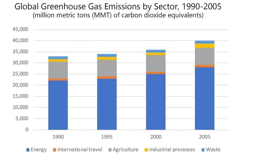
The bar graph details the amount of greenhouse gases, measured in million metric tons (MMT) of carbon dioxide equivalents, that were emitted globally by five sectors (energy, international travel, agriculture, industrial processes and waste) every half-decade from 1990 to 2005. Overall, worldwide greenhouse gas emissions increased steadily over the fifteen-year period by approximately eight to ten percent every five years, and energy was the industry area that created the largest amount of emissions.
In 1990, about 33,000 million metric tons of gas emissions were produced, of which roughly two thirds came from the energy sector. This was nearly three times as much as the second highest industry (agriculture with 7500 MMT) and over twenty times more than the three other sectors, which were very similar (about 1000 MMT). This emission share by sector stayed almost exactly the same in the subsequent years it was measured in, though total global emissions went up (34,000, 36,000 and 40,000 MMT in 1995, 2000 and 2005 respectively). The greenhouse gas emissions created by the industrial processes sector in 2005 (nearly 2000 MMT) reflected a slightly larger jump relative to the other industries’ increases.
Overview of the main features and comparisons.
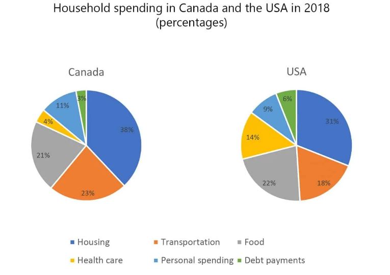
The pie charts give a breakdown of household spending by category in average households in the US and Canada in 2018.
Overall, housing was the primary expense for both Canadians and Americans. Food and transportation were the other two major areas of spending. However, Americans spent significantly more on healthcare and debt payments than Canadians.
The biggest expense in both countries was accommodation, which consumed 38% of Canadian households’ income, versus 31% for American households. In Canada, this was nearly double the proportion spent on transportation (23%) or food (21%). In the United States, the proportion was quite similar, except that food (22%) was a proportionally larger expense than transportation (18%). Another similarity was the amount put into personal spending: around 10% in both countries. The major difference in spending was in the areas of health care—where Canadians spent only 4% compared to 14% in the US—and debt payments, on which Canadians spent a smaller proportion (3%) than did their American counterparts (6%).
Summary of the main features and comparisons of data.
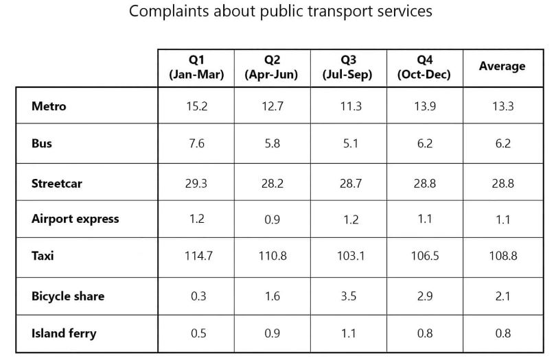
The table provides data about the volume of complaints made by users of seven different types of public transportation. The figures are organised by quarter for the year 2017, per 100,000 passengers. Overall, the largest number of complaints were about taxi services, particularly during the winter months, while the lowest number of complaints were filed about the island ferry and airport express.
Looking at the average figures for the entire year, the number of people per 100,000 who complained about their taxi ride (108.8) was nearly four times as high as that for streetcar (28.8), which was the second most complained about service; the volume of complaints about taxi services was also vastly higher than for metro (13.3) or bus (6.2). The three forms of public transport which received the fewest complaints were island ferry (0.8 complaints per 100,000 passengers), airport express (1.1) and bicycle share (2.1).
The majority of transport services logged their highest number of passenger grievances in the winter months, from January to March. For example, reported problems with taxi services were higher in Q1 (114.7) than in the other quarters of the year (110.8, 103.1 and 106.5 respectively). Bicycle share and island ferry complaints, however, showed the opposite trend; passengers were more dissatisfied with the service during the summer months.
Get a Skype Consultation
By far the best kind of practice is to use the language. Nothing can really replace that. In actual usage, we integrate the skill into who we are, into our emotions, our thoughts, our beliefs, etc.